Bi'Bulut product family
Manta Teknoloji
- brands, one design system
- 4
- languages: TR, EN, DE
- 3
- sections; the order was rebuilt
- 14
- audit, 26 August 2026
- WCAG 2.2 AA
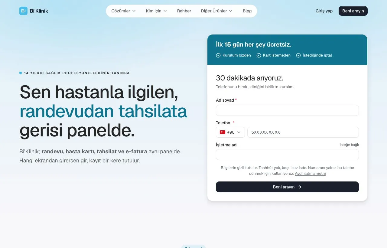
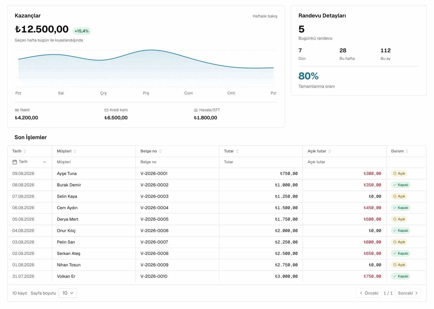
Select a screen to view it at full size.
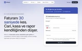
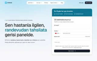
Same structure, four accents
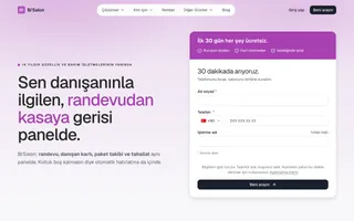
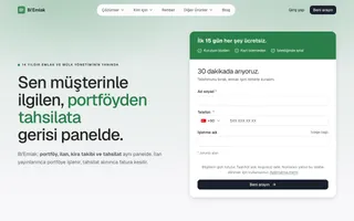
The problem
Four sector brands ran on one backend, but nobody owned how they looked. The old product UI came from a Sneat/Bootstrap admin template and looked like one. The landing page had 14 sections; comparable foreign products have 5 to 9. Which surfaces were live on which brand wasn't written down anywhere.
What we did
We put all four brands on one design system; only the brand color differs. The marketing sites ship from one Next.js codebase, one deploy per brand. We compared the homepage against four competitors and reordered it: social proof up, mobile last. We rewrote the product UI in React; four variants in one monorepo. We ran a WCAG 2.2 AA audit and set up automated accessibility and visual regression tests.
Outcome
Four brands are live: bibulut.co, biklinik.co, bisalon.co, biemlak.co, in Turkish, English and German. The WCAG 2.2 AA accessibility audit was completed on 26 August 2026; findings were closed and the rules became a standing document.
Structure: we looked at competitors and reordered
- The Bi’Klinik homepage was compared with SimplePractice, Cliniko, Jane and Pabau; the order changed, the section count stayed at 14.
- Social proof moved from positions 11 and 12 to 5 and 6; the mobile app section moved from 4th to 13th. A closing detail, not the main promise.
- No invented numbers: no satisfaction rate, user count or ROI figure was written.
The rest of the structure decisions
- Three of the four competitors lead with social proof; Cliniko leads with transparent pricing instead.
- Three merge candidates were measured. One was solved by reordering, two were rejected with reasons. The test: if this section goes, which claim disappears from the page?
- Each brand has its own competitor teardown; the hero line was written after measuring the direct competitor’s page.
Design: four brands, one system
- The neutral palette is fixed across all four brands; they differ only in the accent. The brand color is an accent, not the call to action: the primary button is the same ink color on all four.
- No hex values in code; everything flows from
--color-primaryand its derivatives. Bi’Klinik’s cyan did not pass AA with white text; fills and the focus ring drop to a darker step. - The product UI follows one rule: present data calmly. Color carries meaning, not decoration. Dark mode and TR/EN are there from the start.
Language and tone decisions
- The visual language is Manta’s: plain and restrained. Warmth in the words, restraint in the pixels.
- The landing page addresses the shop owner informally; the business’s own customers are addressed formally. The two registers never mix.
Code and accessibility
- The marketing site is Next.js, one codebase; the brand is chosen at build time and each brand ships to its own domain.
- The product UI is React + Vite + Tailwind in a Turborepo monorepo; four variants, one bundle per variant.
- The WCAG 2.2 AA audit became a standing rules document; visual regression compares the critical pages of all four brands on every merge request.
Pre-release checks
- Blog, solutions and guide sections are live on all four brands.
- The callback form takes a phone number and verifies it by SMS.
- Keyboard flow, screen reader and 200% zoom are checked by hand before each release.